Data Browser / Widget - Pie and Bar Chart
Charts can be used on dashbaords or Data browsers. They provide a visual (graphic) representation of the data at the level selected in the Data Browser or Navigation Tree.
When a series is applied to the PIE chart you can de-select some of the options by clicking on them in the key area.
You will notice that slice of the PIE will disappear and the option in the key range will be greyed out.
This can be useful if one is a large expense, then you can see the comparison between the smaller expenses.
This is also possible with bar charts, by clicking on the key items to hide them.
Widget Icons
Configure
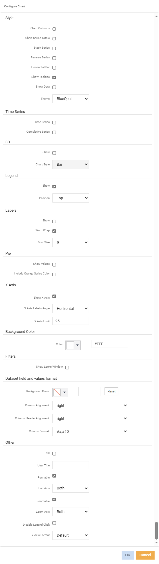
Style
Chart Columns - tick if you want the columns that are already added on the Data Browser window to also be added to the Chart window. As columns are added and/or removed from the Data Browser window, they will also be added and/or removed from the Chart window.
Chart Series Tools - if you wish the series in the Chart window to reflect the Grand Total in the Data Browser as opposed to individual layers.
Stack Series - series information is presented in a stacked format.
Reverse Series - reverses the values of the series.
Horizontal Bar -
Show Tooltips - ticked by default.
Show Data - displays the 'Dataset fields and values'.
Theme - defaults the theme to 'BlueOpal'.
Time Series
Time Series - display the Time Series on the X axis.
Cumulative Series - tick if it is cumulative, meaning each month will show a cumulative YTD amount. If not ticked the amounts shown for each month will be the monthly actuals and not a YTD amount.
3D
Show - tick to display chart in 3D.
Chart Style - select the style of chart to use. For example, Bar, Pie, Line.
Legend
Show - to show which series are on the chart.
Position - select to position the legend.
Labels
Show - tick to show labels.
Word Wrap - ticked by default. If labels are long they will be wrapped.
Font Size - specify what the font size of the labels will be.
Pie
Show Values - tick to show values.
Include Orange Series Colour -
X Axis
Show X Axis -
X Axis Labels Angle - defaults to 'Horizontal'.
X Axis Limit - defailts to '25'.
Background Colour
Colour - select the background colour for the chart via the colour picker or enter the hex code colour.
Filters
Show Locks Window - display the filter locks applied to the chart.
Dataset field and values format
Background Colour - select the background colour for the chart via the colour picker or enter the hex code colour.
Column Alignment - select how the data will be aligned in the column.
Column Header Alignment - select how the column headers will be aligned.
Column Format - choose how the data should be presented.
Other
Title - tick to display the chart title. Enter a title/name in the 'User Title' field below. With no 'User Title' entered, the heading will display the Navigation Tree/drill through and Time Series.
User Title - enter the name of the chart to display. The title will display if 'Title' is ticked.
X Axis Labels Angle - select to display the x axis labels in either horizontal, vertical or 45 degree angle.
Z Axis Limit -
Pannable - ticked by default.
Pan Axis -
Zoomable - focus and enlarge a particular element of the Chart.
Zoom Area -
Theme - select which theme/format of the chart
Disable Legend Click - tick to stop the legend disappearing when clicking in the chart.
Right Click Menus
Zoom To display a specific level/layer
Chart type select the type of chart to view.
Series select which fields to add or remove for the series and specify the format of the series.
-
Series format - specify how you want to present the series.
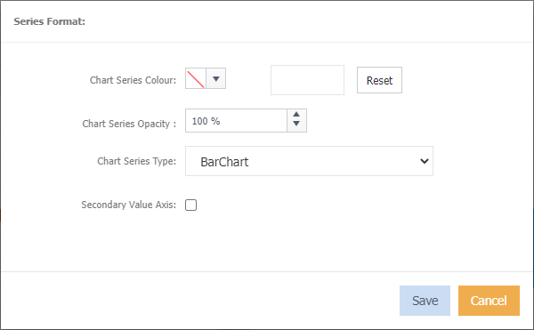
Chart Series Colour select the colour for the series via the colour picker or enter the hex code colour.
Chart Series Opacity select by percentage the level of opacity.
Chart Series Type select the type of chart.
Secondary Value Axis
Send To send the chart to the dashboard.
Configure refer to the above.
Info displays the list of filters currently applied.